RAH x Golden Goose Academy
- RAH Colours
- May 13, 2025
- 3 min read
Colour as a tool for awareness, empathy, and product personalization

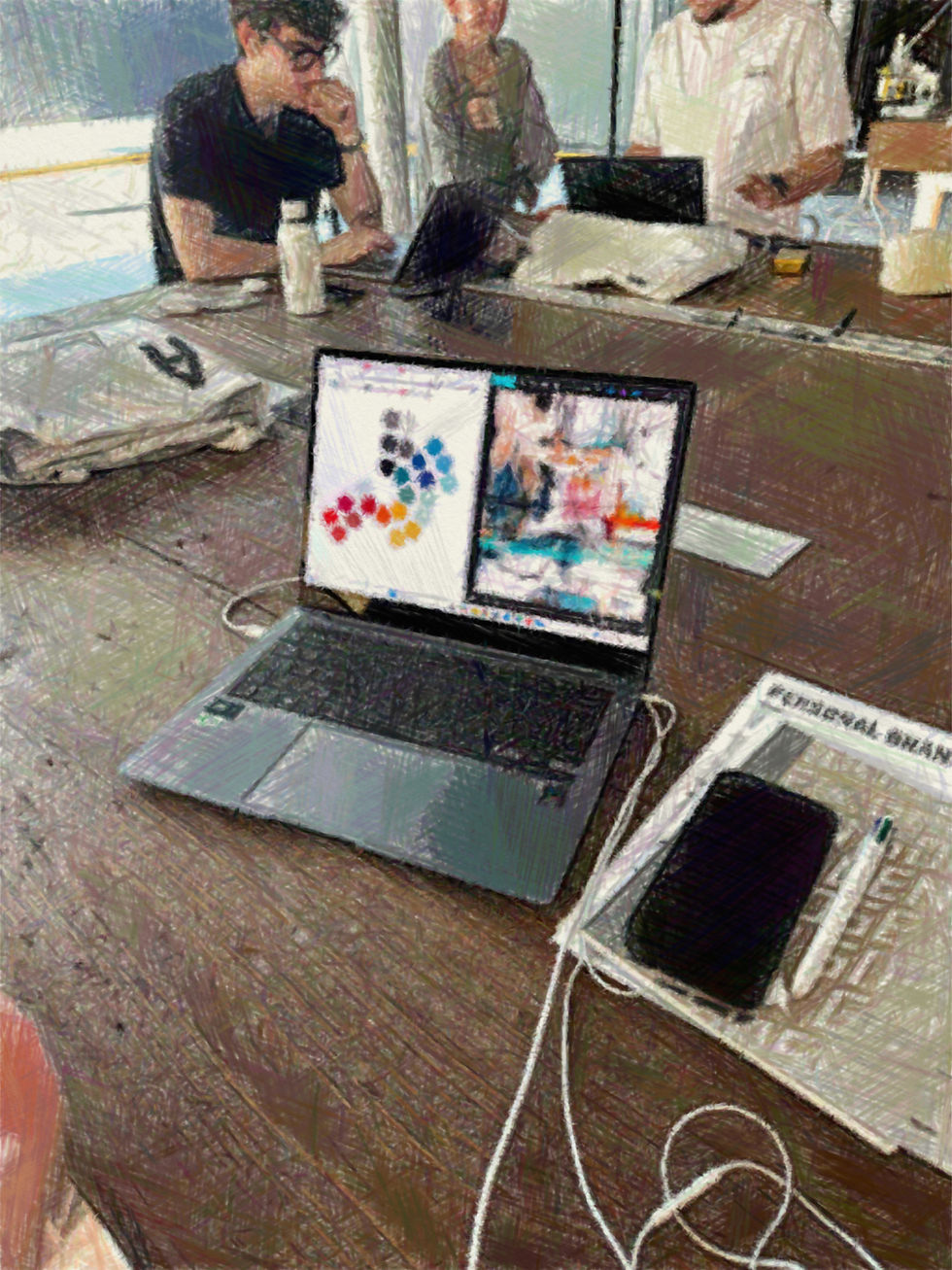
In April, at the Golden Goose headquarters in Marghera (Veneto), the new academic year of the Golden Goose Academy officially began. For the second year in a row, I was invited to lead a session on colour, this time with something new: the students were the very first to have the opportunity to explore the new RAH platform and complete their own personal RAH colour test, together, in real time!
A Deeper Understanding of Colour

Ten students, each with their own screen, took the test individually, yet simultaneously. What followed wasn’t just a set of colour palettes. It was the start of a deeper reflection on how we each experience colour, not as a fixed standard, but as a personal, emotional language shaped by our memories, culture, and history.
Golden Goose made the deliberate choice to place this session at the very beginning of the program, considering it valuable for students to understand their own natural colour tendencies early on. This self-awareness becomes a foundation for how they approach materials, design decisions, and customer interactions throughout the rest of the course.
Colour and Personal Identity
At the start of the lesson, I asked each student what colour meant to them. I listened, took notes, and later, once we reviewed their test results on screen, I referred back to their own words. This made it easy to show how each person’s perception of colour is shaped by their emotional background and individual identity.

Here’s a concrete example: one student, Mahek, shared how the all-black building we were in made her feel isolated from the rest of the world, in an abstract manner. “I’m here, and the rest of the world is out there.” But she also said that when someone is dressed entirely in black, she can only focus on their face; the rest feels closed off. (Poor thing, it can’t be easy living in a world that loves black clothing!) When her RAH palette came out, her feelings became clear: it was made up of 97% light tones. For her, “light” meant openness. So, of course, black felt like a barrier. This isn’t theory, it’s lived experience made visible.
Golden Goose Academy’s Commitment to Personalization and Human-Centred Design
One of the most valuable aspects of working with the Golden Goose Academy is our shared commitment to personalization and human-centred design. Colour is not treated as a trend or rulebook, it’s used as a tool to build stronger connections between product and person. We don’t start with the product and adapt the person to it. We start with the person, and the product follows.
Another point of alignment is our shared vision of leadership: not as a position of authority, but as the ability to guide through ideas, innovation, and integrity. The RAH method doesn’t tell people what to think. It invites them to explore who they are and make choices based on that. Golden embraces this same approach in the way they support and develop their people, from students to managers.

Empathy and Openness in Design
Using the test in a group setting also allowed students to directly compare their results and see how different we all are. The experience naturally sparked empathy and openness. It taught them that what feels “right” or “beautiful” to one person might not resonate at all with another, and that’s not a problem, it’s a strength. Especially in retail or product design, where understanding the customer’s point of view is key.
Golden Goose didn’t just offer a lesson on colour, they chose to place this session at the foundation of their entire training journey. It reflects a clear belief: colour is not just an aesthetic decision, it’s a way of seeing, connecting, and designing with people in mind.

Conclusion: The Role of Colour in Product Culture
This collaboration shows that awareness, creativity, and emotional intelligence can, and should, have a place at the heart of product culture.


Comments